Ever opened a trading app and flicked between five windows just to tell whether the market is “up or down”? The BitX Space overview is built to answer one question as fast as possible: where is the market now, and what deserves attention.
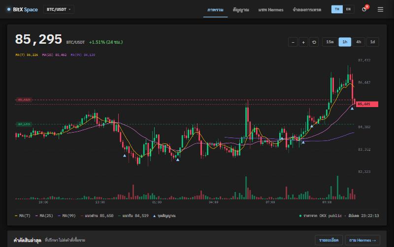
What you see at a glance
- Latest price and 24-hour change top left, the largest thing on the page, because it is what everyone looks for first
- Candlestick chart switchable across 4 timeframes: 15 minutes, 1 hour, 4 hours and daily
- MA(7), MA(25), MA(99) show the short, medium and long trend in one picture
- Support and resistance as dashed lines with their prices
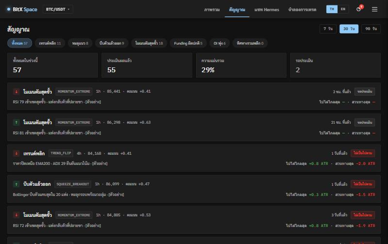
- Signal markers ▲ on the candle where each signal fired, so you can see where the system warned before
The latest verdict: no guessing what the system thinks
Under the chart, the “latest verdict” box shows the latest signal, the price it fired at, and who decided whether to alert — Hermes, the AI assistant, or the system’s rules when the AI is unavailable.
Every verdict carries its reasons, so you don’t have to take it on trust: read it and decide for yourself.
Why several timeframes on one page
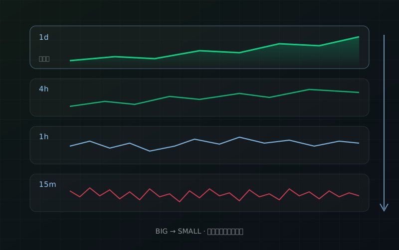
A bullish signal on the 15-minute chart may be just a short bounce inside a daily downtrend. Seeing every timeframe side by side tells you whether you are looking at the small picture or the big one. Read more in “How to read several timeframes without getting lost”.